This is just stupid. I was poking around the OpenOffice.org web site in the area covering
chart types and found this to be rather interesting. It's an example of a
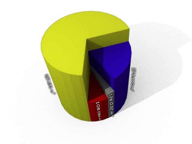
3D pie chart, but it brought back memories of a day back in in my 2-year college when I had a "discussion" with a boneheaded professor about this same topic.
Note that the subtext under the linked example says
- Please Don't Do It -
- Pie charts with different heights have been deemed among the worst graphics representations. The extra-dimension does NOT bring any addition information and annihilates the main concept behind the pie chart.
Strong words indeed. And all of it utter bullshit. There are always times when you need something that others find useless. The classic use of such a chart is "magnitude vs. prevalence". What made me laugh most was that midway through our textbook, there was an example that he tried to skip past as if it didn't exist, but I caught it and made him turn red. It was a graphic showing population of states versus volume of capital investment and showed how some states had higher investment but smaller population. The graphic (3d pie chart) provided the perfect illustration for that purpose. I'm sorry but crap advice like this is what's messing up our world in general.
No comments:
Post a Comment